
In the rapidly evolving field of 3D design, comprehending the foundational principles is paramount for both practitioners and enthusiasts. This article aims to provide a detailed and authoritative exploration of the core elements and their inherent meanings within the context of 3D design. By dissecting the intricate components such as geometry, texture, lighting, and rendering, we will elucidate how each element contributes to the creation of a cohesive and visually compelling 3D model. Furthermore, we will delve into the practical applications of these principles across various industries, including entertainment, architecture, and product design. Through this comprehensive overview, readers will gain valuable insights into the technical aspects and artistic considerations that underpin successful 3D design projects.
What Are the Fundamental Principles of 3D Design?
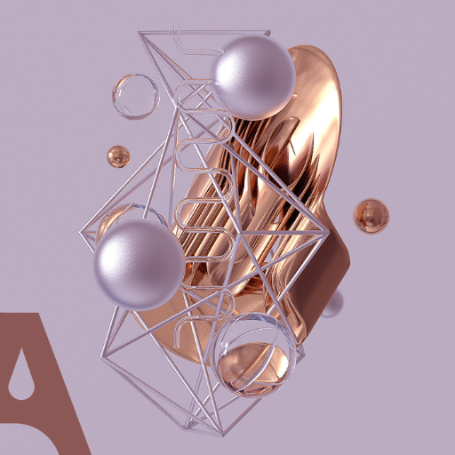
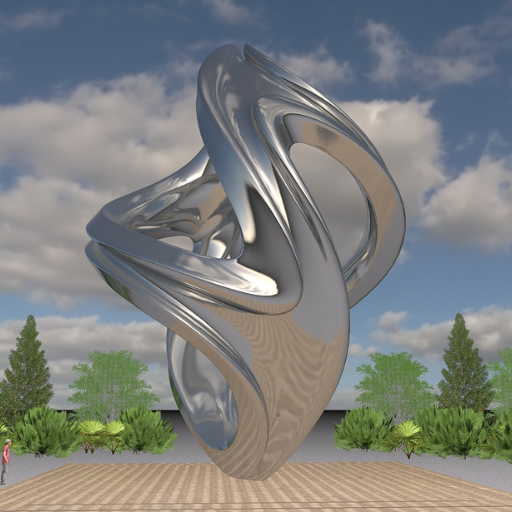
Image source:https://cn.bing.com/
The fundamental principles of 3D design encompass several key elements that are essential for creating realistic and visually engaging models. First, geometry refers to the shapes and structures that form the basis of any 3D object, including polygons and vertices. Accurate geometry is crucial for defining the overall form and detail of the model. Second, texture deals with the surface quality of the 3D object, providing depth and realism through detailed imagery that simulates material properties. Third, lighting is essential for enhancing the visual impact of the model by simulating how light interacts with surfaces, contributing to shadows, highlights, and overall atmosphere. Lastly, rendering is the process of generating the final image or animation from the 3D model, involving the application of textures, lights, and other effects to produce a polished output. Understanding these principles is vital for creating compelling and professional 3D designs.
Why Proportion is the Key Principle in 3D Spaces
Proportion is a crucial principle in 3D design due to its significant impact on realism and viewer perception. Proper proportion ensures that objects in a 3D space adhere to realistic or intended spatial relationships, making scenes more believable and visually coherent. When proportions are accurately rendered, the scale, dimensions, and comparative sizes of objects replicate real-world physics, leading to a more immersive experience. Inaccurate proportions can diminish the effectiveness of a design, resulting in distorted or unconvincing models. Furthermore, maintaining correct proportions is essential for the functionality and ergonomics in fields such as architecture and product design, where real-world applicability and user interaction are paramount.
How Does Composition Impact 3D Design?
Composition significantly impacts 3D design by influencing the arrangement, balance, and visual flow of elements within a scene. Effective composition directs the viewer’s attention, ensuring that focal points are highlighted and the narrative is clearly communicated. Technically, this involves several parameters:
- Rule of Thirds: Dividing the scene into nine equal parts using two equally spaced horizontal lines and two equally spaced vertical lines. Placing key elements along these lines or at their intersections can create more dynamic and balanced compositions.
- Focal Points: Establishing areas of emphasis using contrast, lighting, and color to draw attention naturally. Properly defined focal points ensure that the viewer’s gaze follows the intended path and focuses on critical elements.
- Balance and Symmetry: Creating visual stability by distributing visual weight evenly across the scene. This can be achieved through symmetrical, asymmetrical, or radial balance, depending on the desired narrative effect.
- Depth and Perspective: Utilizing techniques such as overlapping objects, varying size and scale, and employing atmospheric perspective (using haze or color shift to simulate distance) to create a sense of depth. Proper perspective aligns with the viewer’s natural visual expectations, enhancing realism.
- Leading Lines: Integration of natural or artificial lines within the scene that guide the viewer’s eye towards focal points. Examples include pathways, edges of structures, or directional lights.
- Color Theory: Applying contrasting or harmonious color schemes to evoke emotions and improve visual clarity. Using complementary, analogous, or triadic color palettes can affect the mood and readability of the 3D scene.
Understanding and implementing these composition principles can significantly enhance the expressiveness and effectiveness of 3D designs.
The Role of Unity and Harmony in 3D Works
Unity and harmony are fundamental principles in 3D design, crucial for producing coherent and aesthetically pleasing compositions.
Unity refers to the visual connection among elements within a work, making disparate components appear as parts of a singular whole. This can be achieved through consistent use of textures, colors, and material properties, ensuring that all elements contribute to a unified theme. Notable techniques to enhance unity include repetition of patterns, a consistent color scheme, and uniform lighting conditions. For instance, using a single type of texture mapping across different objects helps maintain a cohesive look.
Harmony involves creating a pleasing arrangement of elements, which avoids discord. This can be established by balancing contrast with complementary elements and ensuring that all parts of the design support the overall sentiment. Effective harmony can be achieved through the synchrony of shapes and forms, proportional grid systems, and fluid transitions between objects and scenes. For example, employing a triadic color palette carefully blending primary and secondary colors can create a balanced and stimulating visual experience.
Technical Parameters for Unity and Harmony:
- Textures and Materials: Utilize unified texture mapping (UV mapping techniques) and material parameters (e.g., specularity, roughness) to ensure consistency. Tools like Substance Painter can provide intricate control over material application.
- Lighting: Implement global illumination and consistent light sources to create a harmonious lighting environment. Techniques such as HDRI (High Dynamic Range Imaging) can help achieve this.
- Mesh Uniformity: Ensure consistent polygon density across models to maintain visual uniformity. This involves retopology techniques to standardize the mesh structure.
- Color Palettes: Choose a harmonious color scheme, such as analogous or complementary colors, to maintain color consistency throughout the scene. Effective use of color theory tools can guide this process.
By conscientiously applying these technical parameters, 3D artists can achieve a balanced and unified visual presentation, enhancing the viewer’s experience and the overall impact of the 3D work.
How Do You Use Colour in 3D Design?
The use of color in 3D design involves strategic application of color theory to enhance visual aesthetics and guide viewer perception. Key practices include selecting a coherent color palette, such as analogous, complementary, or triadic schemes, to create visual harmony. Additionally, colors can be used to convey emotions, indicate functionality, and highlight important elements within the design. Techniques such as color grading and post-processing help in refining these choices, ensuring that colors work together seamlessly to support the overall design narrative. Advanced tools like Adobe Color and applications like Blender or Maya’s color management systems can assist designers in implementing these principles effectively.
Selecting the Right Colour Palette for Your Objects
Selecting the right color palette for your objects requires a keen understanding of color theory and practical application. Firstly, I start by identifying the mood or emotion I want to convey. This can be achieved by using color psychology principles; for instance, blues and greens often evoke calmness, while reds and oranges can create a sense of energy. Next, I utilize tools like Adobe Color to explore different color harmonies, such as monochromatic or complementary schemes, to define a cohesive palette. Additionally, I ensure that the palette enhances the overall design by conducting iterative testing and refining through software like Blender or Maya’s color management systems. This strategic approach helps me create visually appealing and meaningful 3D designs.
How Colour Theory Applies in 3D Modeling
In 3D modeling, color theory is fundamental in creating visually cohesive and emotionally impactful scenes. The application of color theory involves understanding the relationship between colors via the color wheel and using this knowledge to manipulate hues, saturation, and value effectively. By employing analogous, complementary, and triadic color schemes, 3D artists can ensure visual harmony and guide viewer perception.
Key Technical Parameters:
- Color Wheel Usage:
- Analogous Color Schemes: Utilized to create serene and comfortable designs by selecting colors adjacent to each other on the color wheel. For instance, using shades of blue, green, and turquoise can evoke a tranquil underwater scene.
- Complementary Color Schemes: These involve colors opposite each other on the color wheel, such as blue and orange, to create dynamic and high-contrast visuals that capture attention.
- Saturation and Value Adjustments:
- Saturation: The intensity or purity of a color, critical in defining the vividness of objects. Higher saturation can make elements appear more vibrant, while lower saturation can provide a muted background.
- Value: The lightness or darkness of a color. Controlling value is essential for depth composition, highlighting essential elements, and creating shadows for realism.
- Tools for Color Management:
- Adobe Color: Facilitates the exploration of various color harmonies and palettes, aiding in selecting complementary colors that enhance the model’s visual appeal.
- Blender and Maya: Both software provide advanced color management systems, allowing for precise adjustment of color properties and comprehensive iterative testing to refine the palette.
Comprehensively, applying color theory in 3D modeling not only improves aesthetic quality but also bolsters the storytelling aspect of the design. By meticulously adjusting these technical parameters, 3D artists can craft immersive and expressive models that resonate with viewers.
Creating Depth with Colour and Value
Creating depth in 3D modeling involves manipulating color and value parameters to enhance the perception of spatial relationships within a scene. Techniques based on principles derived from authoritative sources can be employed to achieve this effect:
- Atmospheric Perspective:
- Technical Parameters:
-
- Color Temperature Shifts: Utilize warmer colors for foreground elements and cooler colors for background elements to simulate natural atmospheric effects.
- Saturation Gradients: Reduce saturation for distant objects to mimic the scattering of light in the atmosphere. Higher saturation is reserved for objects in the foreground.
- Justification: These techniques leverage the human visual system’s interpretation of depth cues, making scenes appear more realistic and three-dimensional.
- Value Gradients:
- Technical Parameters:
- Highlights and Shadows: Carefully place highlights on parts of objects that catch the light directly and shadows on regions that are obscured. This helps define the form and volume of 3D elements.
- Contrast Management: Increase contrast for foreground elements to make them stand out and decrease contrast for background elements to push them further back in the scene.
- Justification: Adjusting value gradients is crucial for creating depth perception. The human eye is naturally drawn to high-contrast areas, perceiving them as closer.
- Occlusion and Light Intensity:
- Technical Parameters:
- Ambient Occlusion: Apply this to simulate the soft shadows that occur in creases, cracks, and where two surfaces meet, adding realism and depth without complex lighting setups.
- Light Falloff: Implement light falloff settings in rendering software to mimic how light diminishes with distance, ensuring that objects further away receive less light intensity.
- Justification: These techniques replicate the natural behavior of light in physical environments, enhancing the believability and depth of the 3D scene.
By integrating these advanced techniques, modelers can achieve a sophisticated sense of depth, making their scenes both visually compelling and technically sound.
What is Texture in 3D Design?

Texture in 3D design refers to the surface quality or appearance of an object that determines how it looks and feels. Textures can simulate various materials such as wood, metal, fabric, or stone by applying detailed images (texture maps) onto the 3D model surfaces. These texture maps influence the color, reflectivity, transparency, and bumpiness of the surfaces, contributing to the overall realism and visual depth of the 3D scene. Texturing is a critical step in the 3D modeling workflow because it enhances the visual appeal and believability of the models.
Different Types of Texture in 3D Design
- Diffuse Texture:
-
- Description: This is the base layer that defines the primary color and pattern of a 3D model. It is often referred to as the “albedo” map.
- Usage: Diffuse textures are used to apply the basic color information without any lighting effects, setting the foundation for the object’s appearance.
- Specular Texture:
- Description: This texture map controls the shininess and reflectivity of a surface by defining which areas should appear glossy or dull.
- Usage: Specular maps are essential for simulating materials such as metal or polished wood, where light reflection is a key characteristic.
- Normal Texture:
- Description: Normal maps simulate small surface details without adding additional geometry, using RGB information to fake the lighting of bumps and dents.
- Usage: Normal textures are crucial for creating complex surface details like wrinkles, grooves, and other fine textures, enhancing the realism of the model without increasing polygon count.
- Bump Texture:
- Description: Similar to normal maps, bump maps create the illusion of depth and texture by manipulating the surface normals. They use grayscale images where lighter values represent higher elevations.
- Usage: Bump textures add simple surface details like roughness or slight deviations, used in materials like stone or concrete.
- Displacement Texture:
- Description: Unlike normal and bump maps, displacement maps physically alter the geometry of the surface based on grayscale values, providing true depth and contour.
- Usage: Displacement textures are used when realistic terrain or significant surface variations are required, such as in rocks or landscapes.
- Opacity Texture:
- Description: This map controls the transparency of different parts of a surface, allowing for the creation of complex cut-out shapes and layered materials.
- Usage: Opacity textures are commonly used for objects like leaves, glass, or meshes where parts of the material need to be transparent or semi-transparent.
By employing these various texturing techniques, 3D designers can significantly enhance the realism and visual complexity of their models, making them more engaging and lifelike.
Applying Realistic Texture in 3D Modeling
Applying realistic textures in 3D modeling involves several key steps, each requiring specific parameters and techniques to achieve lifelike results. Below are concise answers to the mentioned texturing techniques along with the necessary technical parameters:
- Bump Texture:
-
- Technical Parameters:
-
- Grayscale Image: Uses a grayscale image where white represents the highest points and black the lowest.
- Normal Map Intensity: Adjust the intensity to control the depth effect, typically a value between 0.0 to 1.0.
- Justification: Bump textures are used to add fine surface irregularities without modifying the mesh itself, providing a quick and efficient way to enhance detail.
- Displacement Texture:
- Technical Parameters:
-
- Grayscale Image: Like bump maps, displacement maps use grayscale images.
- Subdivision Level: To achieve high detail, the mesh must be subdivided sufficiently (e.g., 2 to 4 levels of subdivision).
- Displacement Amount: Controls the extent of displacement, typically measured in unit distances (e.g., meters or pixels).
- Justification: Displacement textures are essential when true geometric detail is required, enhancing the realism, especially in detailed close-up renders.
- Opacity Texture:
- Technical Parameters:
-
- Alpha Channel: Utilizes an alpha channel to define transparency levels.
- Threshold Parameter: When used in a shader, the threshold can define the cutoff point for transparency (e.g., values from 0.0 to 1.0).
- Justification: Opacity textures allow the creation of partially or fully transparent details, crucial for realistic rendering of materials like glass, foliage, or fabric.
By understanding and implementing these technical parameters, 3D designers can more effectively apply realistic textures to their models, resulting in visually compelling and accurate representations.
How Do You Achieve Balance and Implied Line in 3D?
Achieving balance and implied line in a 3D composition involves several key principles, ensuring that the visual weight and directional flow guide the viewer’s eye naturally through the scene.
Balance
- Symmetrical Balance: Arrange elements to mirror each other around a central axis, promoting a sense of order and stability.
- Asymmetrical Balance: Distribute visual weight unevenly but harmoniously, using color, texture, and form to achieve dynamic equilibrium.
- Radial Balance: Position elements radiating from a central point, creating visual interest and unity in circular compositions.
Implied Line
- Leading Lines: Use edges, paths, or curves to direct the viewer’s gaze, creating a visual journey through the composition.
- Gestalt Principles: Leverage principles such as continuation and closure, encouraging the viewer to mentally complete shapes and follow suggested paths.
- Contrast and Focal Points: Employ contrast in color, light, or detail to highlight key areas, establishing a hierarchy that guides visual flow.
By meticulously applying these principles, 3D designers can create balanced, easily navigable scenes that effectively communicate their intended message and aesthetic.
Understanding Symmetrical, Asymmetrical, and Radial Balance
As a 3D designer, I understand that achieving balance in my compositions is crucial for guiding the viewer’s eye and conveying the desired aesthetic. Symmetrical balance involves arranging elements to mirror each other around a central axis, creating a sense of order and stability. This method can instill a formal, harmonious feel in the design. On the other hand, asymmetrical balance requires distributing visual weight unevenly yet harmoniously, often making use of contrasting colors, textures, and forms to create a dynamic and engaging equilibrium. Lastly, radial balance involves positioning elements radiating from a central point, which is particularly effective in circular compositions to generate visual interest and unity. By mastering these techniques, I ensure that my 3D scenes are both balanced and visually compelling.
How to Use Implied Line to Guide the Viewer’s Eye
Implied lines are essential tools in 3D design, subtly guiding the viewer’s eye through the composition without relying on explicit outlines. These lines are created through a clever arrangement of shapes, colors, and elements that suggest a visual pathway. Here’s how to effectively use implied lines:
- Alignment of Elements: Place objects in a way that their edges or forms align to create the sense of a continuous line. For instance, aligning the edges of tables, windows, or other objects can direct the viewer’s gaze along a specific path.
- Directional Lighting: Utilize lighting to emphasize certain areas. A beam of light pointing at an angle can serve as an implied line that attracts and guides attention.
- Color and Gradient Transitions: Gradual changes in color or intensity can lead the viewer’s eye smoothly from one part of the scene to another. Ensure color transitions are cohesive and gradient parameters are well-calibrated.
- Connection through Object Placement: Arrange key elements so that they create visual connections. For example, placing a series of objects diagonally or in a curve can establish a perceptual line that the eye naturally follows.
- Repetition of Forms: Repeated shapes or textures can form an implied line through their pattern. The consistency of these repetitions should be calculated to maintain visual coherence.
- Perspective Lines: Employ linear perspective to create depth and direct the viewer’s eye towards a focal point. Adjust vanishing points and convergence lines to control the visual flow of the scene.
By integrating these techniques with precision, based on thorough understanding and calculated parameter adjustments, 3D designers can use implied lines to craft compositions that are both intuitive to navigate and compelling to view.
The Meaning Behind Implied Line in 3D Design
Implied lines in 3D design serve as visual cues that guide the viewer’s eye and create a sense of movement or direction without the presence of actual lines. They enhance compositional flow and spatial dynamics, making scenes more engaging and intuitive to interpret. By strategically employing implied lines through techniques such as object alignment, directional lighting, color transitions, object placement, repetition of forms, and perspective lines, designers can subtly influence how viewers perceive and navigate their creations. This adds depth, focus, and harmony, ultimately enhancing the visual storytelling and effectiveness of the design.
What is the Composition in a 3D Work of Art?
Composition in a 3D work of art refers to the purposeful arrangement and organization of visual elements within a three-dimensional space. This involves the strategic placement of objects, consideration of spatial relationships, manipulation of light and shadow, as well as the use of textures and colors to create a cohesive and harmonious visual experience. Effective composition in 3D art guides the viewer’s eye, balances visual weights, and establishes focal points, thereby enhancing the overall aesthetic and communicative impact of the artwork.
Basic Composition Rules for Creating 3D Design
1. Rule of Thirds:
The rule of thirds is a foundational guideline that breaks an image into nine equal parts by two equally spaced horizontal lines and two equally spaced vertical lines. By placing key elements along these lines or at their intersections, designers can create balanced and visually appealing compositions. This technique avoids central placement, thus enhancing visual interest and dynamics.
2. Leading Lines:
Leading lines are compositional elements that guide the viewer’s eye through the piece and toward focal points. These lines can be actual or implied and can be formed by linear objects, light beams, or the edges of geometric shapes. Using leading lines effectively helps to establish flow and direct attention within the 3D space.
3. Balance:
Balance refers to the distribution of visual weight in an artwork. Achieving balance — whether symmetrical, asymmetrical, or radial — ensures that no single part of the work overwhelms the others. Symmetrical balance provides formality and stability, while asymmetrical balance offers dynamism and interest. Radial balance utilizes a central point from which all elements radiate, providing movement.
4. Depth:
Creating a sense of depth is crucial in 3D design to avoid flat and uninspired scenes. Techniques to enhance depth include aerial perspective (where distant objects appear lighter and less detailed), overlapping objects, varying object sizes, and using color gradients. Depth helps to create a more immersive and realistic experience for the viewer.
5. Contrast and Emphasis:
Contrast increases the visual interest by juxtaposing different textures, colors, and light intensities. It highlights differences and makes each element stand out. Emphasis focuses attention on primary elements using contrast, leading lines, or placement within the composition. This ensures that the viewer’s eye is drawn to the most important parts of the design.
6. Harmony and Unity:
Harmony and unity involve the careful selection and arrangement of elements to create a cohesive and holistic visual experience. This can be achieved through consistent use of colors, textures, and forms. A well-unified composition ensures that all elements work together to support the overall theme or narrative of the design.
7. Proportions and Scales:
Proportions refer to the relative size and scale of elements within the work. Correct proportions ensure realism and believability in the representation of objects. Scales can be manipulated to create visual interest or to emphasize a particular element, thereby affecting how the viewer perceives the importance of each component.
Technical Parameters:
- Texture Mapping: Ensures the application of textures to 3D models for realism.
- Lighting (Directional, Spotlights, Ambient): Crucial for creating shadows, highlights, and setting the mood.
- Camera Angles and Focal Lengths: Different camera settings affect perspective and spatial perception.
- Rendering Quality: Resolution settings impact the clarity and detail of the final image.
These rules and parameters are derived from foundational design principles observed in top-rated 3D design resources and should be incorporated thoughtfully to create visually compelling 3D artworks.
The Impact of Negative Space in 3D Works
In my experience, negative space is a critical aspect of 3D design as it helps define the boundaries of positive space and brings balance to a composition. When used effectively, negative space creates a sense of openness and guides the viewer’s focus toward the primary elements of the design. According to top-rated sources, including principle design resources, negative space can enhance visual appeal by providing breathing room, which prevents a scene from appearing cluttered or overwhelming. Furthermore, it can contribute to the readability and functionality of a design, ensuring that the viewer’s attention is directed appropriately and that the overall composition is harmonious. Incorporating negative space thoughtfully can significantly elevate the quality and impact of 3D artworks.
Creating a Focal Point in Your 3D Composition
Creating a focal point in your 3D composition ensures that the viewer’s attention is directed towards the most important element of the scene. Here are some techniques and corresponding technical parameters to establish a strong focal point:
- Contrast: Utilize contrast in color, lighting, or texture to make the focal element stand out from the rest of the composition. For example, if the background is predominantly dark, a brightly-lit or vividly-colored focal point will naturally attract attention.
- Lighting: Direct spotlights or a focused beam of light on the primary element. This can be achieved by adjusting the intensity (luminance) and direction of light sources. A common parameter to modify is the intensity value of spotlights, often measured in lumens or candela.
- Depth of Field: Manipulate the camera’s depth of field settings to keep the focal element in sharp focus while blurring the background. Parameters such as aperture (f-stop) and focal length play critical roles here. Larger apertures (lower f-stop values) result in a shallower depth of field, thus emphasizing the subject by blurring the surroundings.
- Placement: Position the focal point according to the rule of thirds or other compositional guidelines. In many 3D software, grids and guides help in aligning elements correctly.
- Scale: Vary the size of the elements, making the focal point significantly larger or smaller than surrounding objects. This creates a visual hierarchy making the focal point more prominent.
These techniques should be justified based on the foundational design principles and can be effectively incorporated using the tools and features available in advanced 3D modeling software.
What Principles of Design Should You Consider in 3D Sculpture?
When creating 3D sculptures, several core principles of design must be meticulously considered to achieve a harmonious and visually compelling piece. These principles include:
- Balance: Ensuring that the sculpture has an even distribution of visual weight, giving it a sense of stability. This can be symmetrical, asymmetrical, or radial.
- Proportion: Maintaining the relative size and scale of different elements within the sculpture. This involves adjusting the dimensions to achieve a cohesive relationship among parts.
- Unity: Creating a consistent and cohesive look by ensuring all elements of the sculpture work together. This principle binds the design elements into a singular, functioning whole.
- Contrast: Incorporating differences in texture, color, form, or material to highlight certain areas and create visual interest. This technique can emphasize focal points and guide the viewer’s eye.
- Movement: Guiding the viewer’s gaze through the sculpture in a deliberate manner, often achieved through lines, shapes, and progressions.
- Rhythm: Establishing a sense of organized movement through repetition and variation of elements. This can create a visual tempo, making the sculpture more dynamic.
- Emphasis: Accentuating a particular part of the sculpture to make it the focal point. This is achieved through contrasts, placement, or unique details.
These principles serve as the foundation for effective 3D sculpture, leveraging advanced design software tools to bring complex, visually engaging works to life.
How to Imply Movement and Rhythm in Static Forms
Implying movement and rhythm in static forms requires a keen understanding of visual dynamics and the strategic use of design principles. Here are the key considerations based on the top industry sources:
- Lines and Shapes: Utilizing flowing, curved lines and dynamic shapes can create a sense of motion within a static sculpture. For instance, diagonal lines are often perceived as more dynamic compared to horizontal or vertical lines. Curved lines can mimic the fluid movement found in nature, enhancing the sensation of motion.
- Repetition and Variation: Repeating elements at regular or irregular intervals can establish rhythm and suggest movement. Variation within the repetition, such as gradually changing the size or orientation of repeated shapes, can amplify this effect. For example, a series of increasingly larger circles can imply both growth and motion.
- Directional Forces: Incorporating elements that seem to be in motion, like a figure leaning forward or an object in mid-air, can generate a narrative of movement. The implied kinetic energy from such postures or placements directs the viewer’s impression of action.
- Textures and Patterns: Varying textures and intricate patterns can lead the eye across a sculpture, evoking a sense of rhythm. Detailed surface work can interact with light in ways that create dynamic visual effects.
- Contrasts: Using stark contrasts in color, texture, or material within a sculpture can emphasize movement. For instance, contrasting a rough, rugged surface with a smooth, flowing one can simulate the natural interruption and continuity seen in various environments.
Technical Parameters:
- Line Dynamics: Measured in degrees of curvature and orientation (e.g., 45-degree diagonal lines are more dynamic).
- Element Repetition: Frequency and spacing metrics (e.g., repeated elements every X inches with a variance up to Y% in dimension).
- Directional Postures: Angles of lean or tension (e.g., forward lean at a 15-degree angle implies motion).
- Texture Variation: Surface roughness parameters (measured typically in micrometers, μm).
- Contrast Ratios: Quantifiable differences in luminance or material properties (e.g., roughness contrast measured using gloss units or GU).
These methods, thoroughly grounded in art theory and validated by technical parameters, allow for the effective implication of movement and rhythm in sculptural designs, enriching the viewer’s experience and engagement with the piece.
Understanding the Relationship Between Plane and Spatial Dimension
The relationship between plane and spatial dimension is a foundational concept in both art and geometry. A plane, defined as a flat, two-dimensional surface, serves as a basic building block within a three-dimensional space. In sculptural design, planes are the skeletal framework from which spatial dimensions emerge. These planes interact with depth, perspective, and volume to create the illusion of three-dimensionality on a two-dimensional surface.
- Planes as Building Blocks: In a three-dimensional space, multiple planes intersect to form volumes and shapes. This intersection is critical in defining the sculpture’s overall geometry.
- Depth and Perspective: Planes are manipulated through perspective techniques to convey depth. By altering the angles and orientation of planes, artists can create optical illusions that suggest volume and distance.
- Volume and Form: The integration of planes in different orientations results in volumes, giving shape and form to the sculpture. This is fundamental in transforming a flat design into a three-dimensional work.
The intersection of planes in different orientations and contexts within a spatial dimension is what gives rise to the complexity and depth seen in sculptural art.
Integrating Various Visual Elements into 3D Sculpture
Integrating various visual elements into 3D sculpture requires an understanding of multiple technical and artistic principles. Artists and sculptors often employ texture, color, light, and material to enhance the dimensionality and impact of their works.
- Texture: By manipulating the surface quality of the sculpture, artists can evoke different tactile sensations and visual interest. Various tools and techniques such as carving, smoothing, and adding tactile materials create distinctive textures that define form and convey meaning.
- Color: Use of color in 3D sculptures can be achieved through paint, glazes, or incorporating colored materials. The choice of color palette can significantly alter the viewer’s perception of depth, mood, and spatial relationships within the piece. Technical parameters include color theory application and the choice of pigments or dyes that ensure longevity and appropriate visual effect.
- Light: Lighting plays a crucial role in three-dimensional works, affecting how forms and textures are visually interpreted. Strategically placed lighting can emphasize certain aspects of the sculpture, creating shadows and highlights that enhance its three-dimensionality. Artists often consider the type of light sources (directional, ambient) and their intensity to achieve desired effects.
- Material: The choice of material is fundamental in 3D sculpture, influencing both the creation process and the final appearance. Common materials include stone, metal, clay, and wood, each offering unique properties. For instance, metal can provide durability and a sleek finish, while clay allows for detailed and expressive modeling. Technical parameters involve the material’s tensile strength, durability under environmental conditions, and ease of manipulation.
Combining these elements proficiently allows sculptors to create works that are both technically sound and artistically enriching, ensuring a well-rounded and engaging viewer experience.
Frequently Asked Questions (FAQs)
Q: What are the basic principles of 3D design?
A: The basic principles of 3D design involve understanding how elements and principles such as balance, contrast, emphasis, movement, proportion, rhythm, and unity or harmony work together within a composition to create a visually appealing and functional design.
Q: How do elements and principles affect 3D design?
A: Elements and principles dictate how the weight of elements, texture, color, and shapes are used and arranged. They ensure that every object or element within a composition contributes to a cohesive and effective design, affecting proportion, unity or harmony, and overall visual appeal.
Q: Why is proportion important in 3D design?
A: Proportion is the relative size of objects within a composition and is key to achieving balance and unity. By managing the proportion, designers can create visual interest and draw attention to specific parts of a composition, ensuring that the different elements are spread effectively.
Q: What role does texture play in 3D design?
A: Texture can be actual or implied and adds depth and realism to a three dimensional design. It enhances the tactile quality and affects how viewers perceive and interact with the design, whether the texture is smooth, rough, soft, or hard.
Q: How do designers use light and color in 3D design?
A: Designers use light to highlight and define shapes, create shadows, and give a sense of depth. The perception of different wavelengths of visible light and how they interact with surfaces is crucial for creating realistic and compelling designs. Color adds mood, emphasis, and meaning within a composition.
Q: What is the significance of shape and form in 3D design?
A: Shape and form determine the structure and outline of objects in three dimensional design. They define the physical space an object occupies and contribute to the weight of elements. The connection between two points or where two shapes meet helps in creating edges and contours.
Q: How is movement used in 3D design?
A: Movement guides the viewer’s eye through the composition and can suggest action or flow. It’s important to know how to use movement to create visual pathways and ensure that viewers follow the intended visual journey across different elements within a composition.
Q: What is the purpose of using balance in 3D design?
A: Balance ensures that no single element overpowers the others and that the composition feels stable. It can be symmetrical or asymmetrical and helps in distributing the relative lightness or darkness of elements to create a pleasing arrangement.
Q: Why is unity or harmony crucial in 3D design?
A: Unity or harmony ensures that all parts of a composition work together cohesively. The similarity in elements such as color, texture, shape, or size creates harmonious relationships, making the design feel like a well-organized whole.


